


Graphing Oil and Natural Gas Production: Let’s Get All the Lines Going Up

Mark Green
Posted October 19, 2012
Lots of discussion this week about energy production from federally controlled areas – onshore and offshore – as a subset of an overall rise in U.S. oil and natural gas output. Some charts to consider, developed from data in the U.S. Energy Information Administration’s most recent short-term energy outlook report, released earlier this month.
First, graphing U.S. crude oil production from federal and non-federal areas:
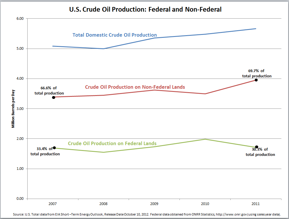
As you can see, U.S. crude production has increased steadily since 2008 (blue top line). Remember, the oil production timeline is a long one. Offshore and onshore projects can take up to a decade to develop, from leasing to actual production. Broken out by area, crude production on non-federal lands (69.7 percent of total production) has risen dramatically since 2010 (red line). Since 2010 crude production from areas controlled by the federal government has fallen (green line).
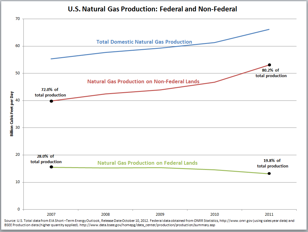
Here’s a look a natural gas production, federal and non-federal:
Overall domestic natural gas production (blue line) has climbed sharply – owing to advances in shale development through hydraulic fracturing and horizontal drilling. Look at the red line. Production from non-federal areas parallels the top line, indicating overall growth is being driven by production from areas not controlled by Washington. Indeed, natural gas from federally controlled areas started declining in 2009.
These charts suggest something important: Imagine what could happen with U.S. oil and natural gas production with increased access to public resources, with increased drilling. With the right policies in place the production line for federal areas could mirror that of the non-federal.
Actually, we don’t have to imagine too much. According to Wood Mackenzie’s analysis, we could see more domestic energy produced, more jobs and more revenues to government. In less than 15 years we could see 100 percent of our liquid fuel needs met through domestic oil and gas production, increases in biofuels and crude from friend and neighbor Canada. And we could see all of the plot lines on both these charts heading up, reflecting a more secure U.S. energy future.
About The Author
Mark Green joined API after a career in newspaper journalism, including 16 years as national editorial writer for The Oklahoman in the paper’s Washington bureau. Previously, Mark was a reporter, copy editor and sports editor at an assortment of newspapers. He earned his journalism degree from the University of Oklahoma and master’s in journalism and public affairs from American University. He and his wife Pamela have two grown children and six grandchildren.